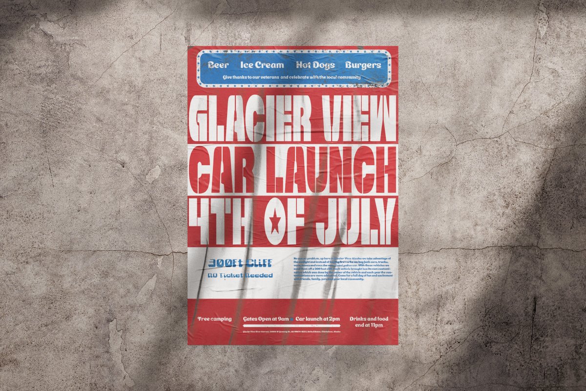
Typography Poster, Festival
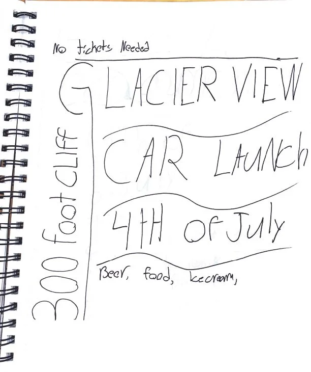
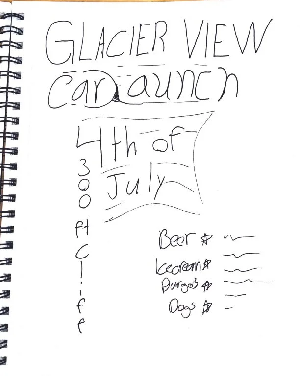
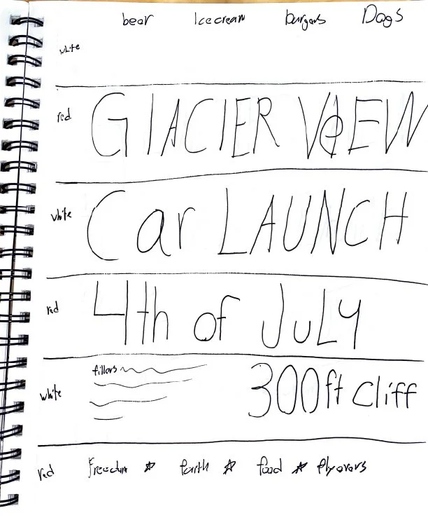
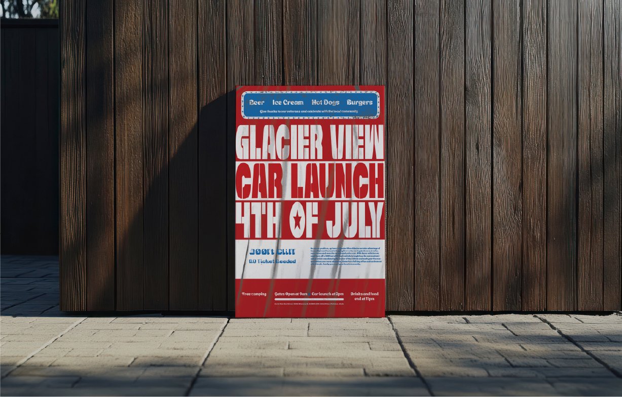
When first starting the typographic poster, we were asked to have digital and physical manipulations included throughout, deciding to do a fourth of July festival I knew a flag should be incorporated, which gave my idea for my physical manipulation which was hanging a bed sheet and scanning it for the look of a hanging flag. To add more to the poster, I added a wear and tear look to the body text/information to fit the theme of the festival, which was sending old rusty cars off a cliff because at that time of year in Alaska, it does not get dark. Using the stripes of the American flag to add to the grid, it had come together nicely.
Before

After
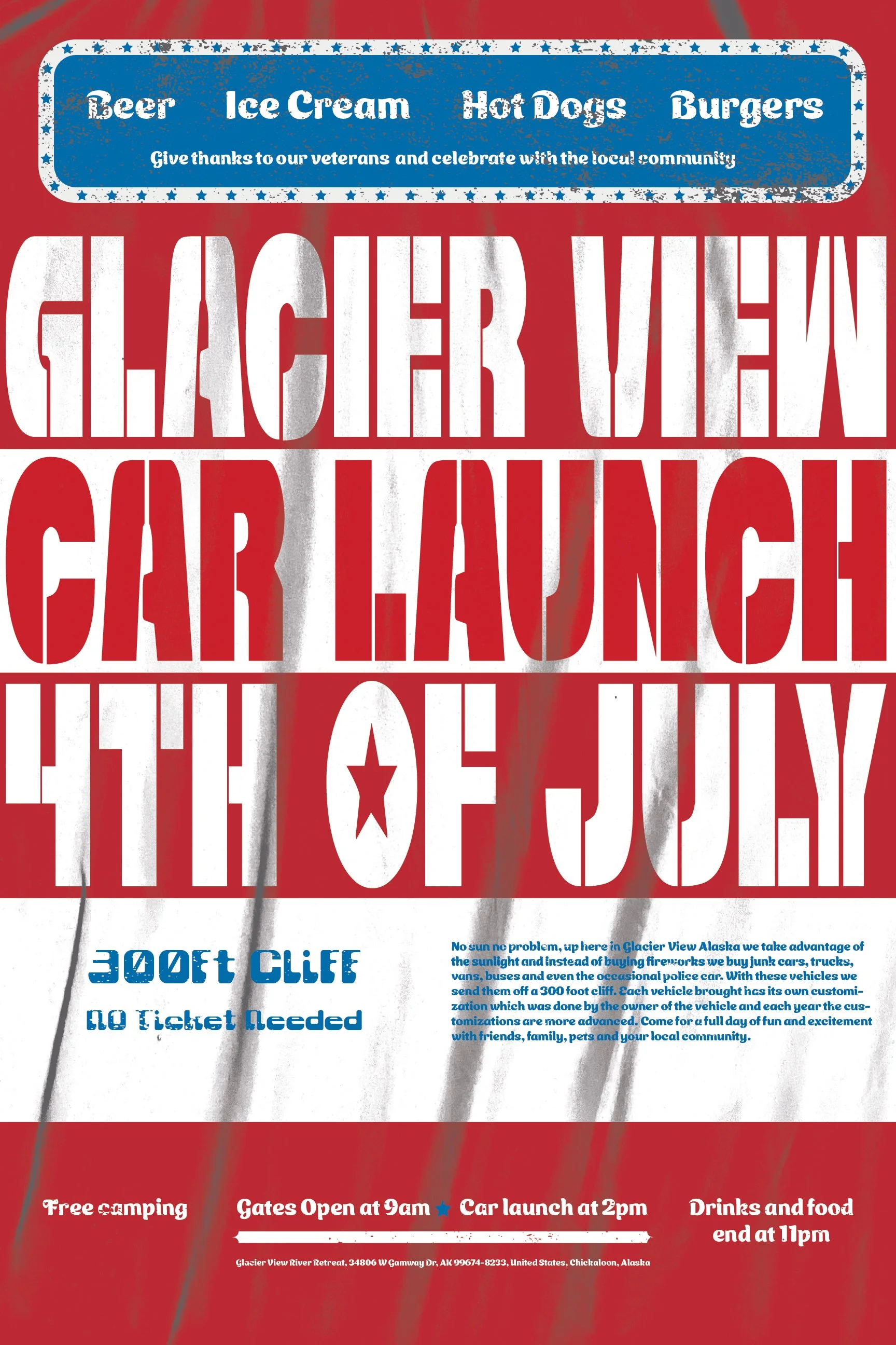
After critique and some work, the initial changes made to the poster were some color and texture adjustments for a more realistic flag look. Next, I put the wear and tear overlay only on the body text and not the main title to give more depth. Lastly, some scaling adjustments to the body text to avoid hierarchy confusion throughout.
Process Sketches